The quality of collected data is important to Collect Earth Online’s users. Some common data collection issues include users misunderstanding the question asked, or difficulty classifying land covers.
CEO’s new external data QAQC dashboard enhances data quality by integrating multiple information streams, including user-collected data and external models and datasets. This approach is sometimes called “convergence of evidence.” For example, projects can now check user-collected land cover data with the output of an AI model or simply compare multiple user’s responses easily.
The new dashboard allows institution administrators to easily compare user’s answers and/or connect an external data stream with specific question(s) in a project’s survey.
This functionality improves the quality of data collected in CEO by helping to identify misclassifications early, identify bad actors or poor quality interpretations, facilitate discussion on misunderstandings during data collection workshops, and streamlines reviewer efforts by concentrating on plots that are more likely to be inaccurately classified.
Comparison between the external data and CEO collected data is made by comparing the answers from the external data stream to the user collected data in CEO. The results of this comparison will be shown as an interactive report in the QAQC dashboard page for the project.
The dashboard calculates disagreement for survey questions either by comparing answers between interpreters, or by comparing the answers in the external data stream with the answers provided by the interpreter(s). Disagreement is set to 0 when there is no external data source provided and only one interpretation per plot.
Currently, the optional external data stream can be tabular data, including JSON or CSV files.
The data file should contain an answer for each question that you want to validate with an external dataset for all plots/samples in the project. Tabular datasets will need to include one row for each plot, with columns containing information corresponding to one survey question. These tabular datasets can be derived from raster or vector data using a tool like QGIS or GEE.

For example, suppose you want to validate a question asking if the land cover is forest or non-forest. Your tabular data should have one row for each plot/sample. One of your columns should include the correct answer to this question for each plot/sample. This column will correspond to the survey question in CEO asking data collectors whether the plot is forest/non-forest.
The user interface for the QAQC dashboard is accessible from the Project Management pane. The dashboard provides tools to better visualize the data collected and, if applicable, to compare the data collected with the external data streams.
Data visualization options include project statistics, plot statistics, and user statistics. These options help institution administrators quickly identify issues in three ways. Project statistics helps to quickly locate plots with high disagreement or that are flagged by data collectors. The plot statistics pane provides details about different user’s responses to survey questions, while the user statistics pane provides details to help identify user’s data contributions and potential bad actors.
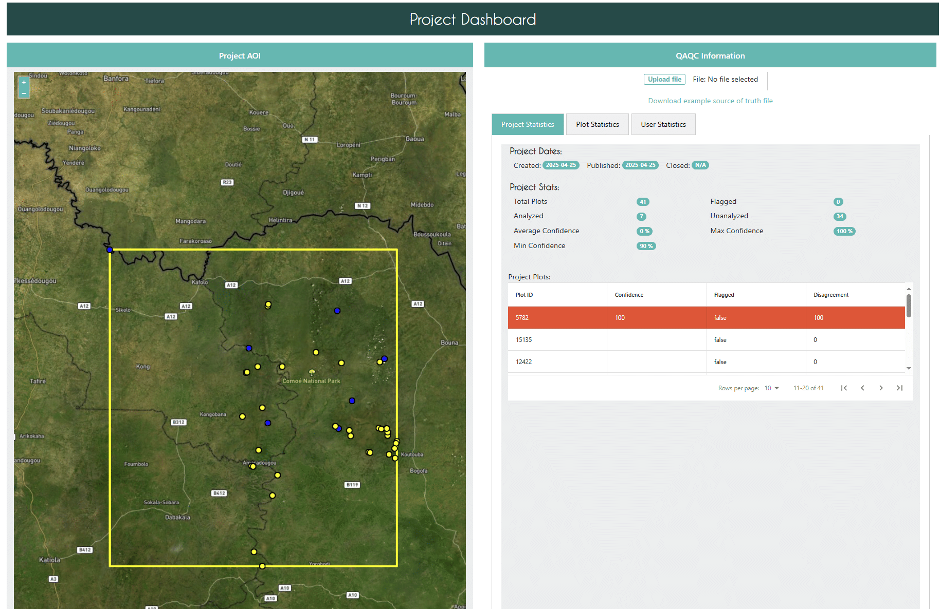
In the Project Statistics tab of the QAQC dashboard, project administrators get an overview of the project with useful statistics and a table containing details about each plot. On the left hand side is a map with the project’s area of interest (AOI). Plots with high disagreement are colored red.
At the top right is a place to verify or add the external data source. Beneath this are some general project statistics, including the total number of plots, information about plot confidence, and number of plots that are flagged or have high disagreement.
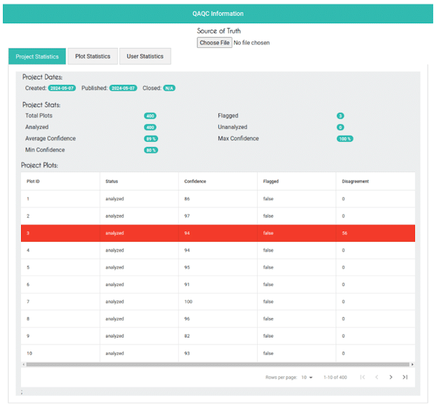
for disagreements higher than 50, the row in the table is highlighted in red, for better visualization. Every column is also sortable.
Echoing the QAQC dashboard landing page, the left side of the screen shows the plot outline. The right side of the screen includes specific information about the plot, including the number of samples and the disagreement %. Below the plot overview data is a table with more information about the interpretation data, including each user’s answers.
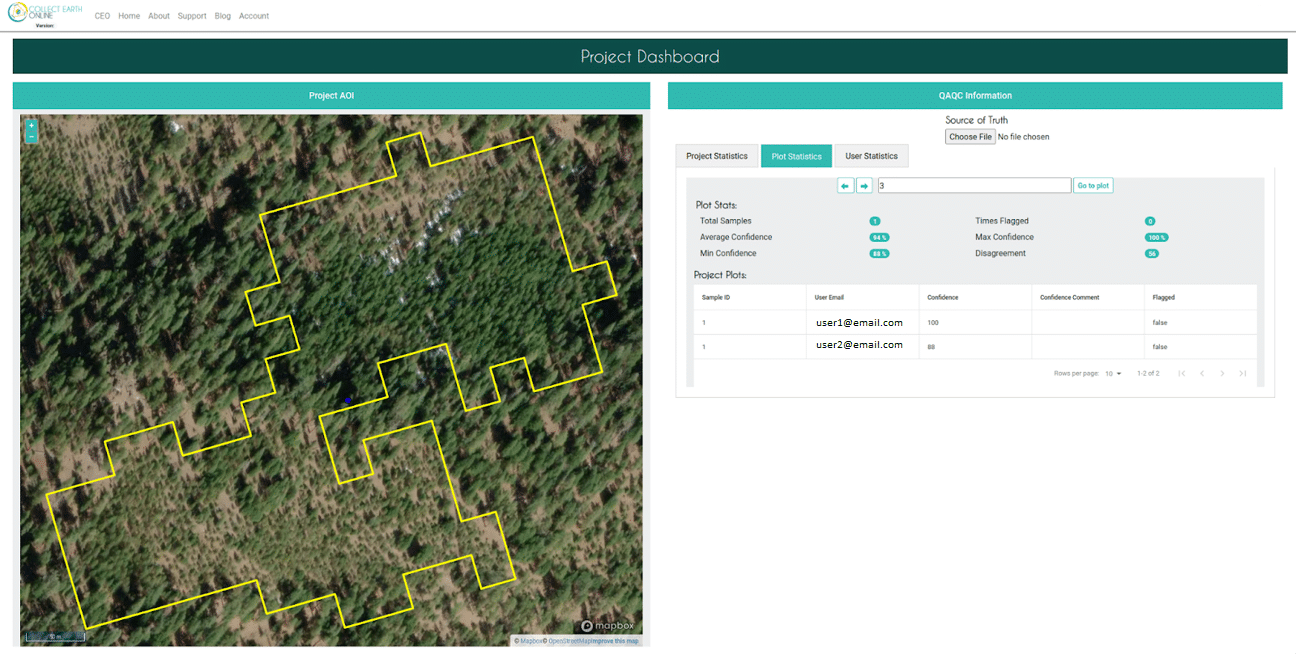
The table on this page shows information for every interpretation of all the samples available in that plot. Note that for projects in which guest users without CEO accounts can interpret, this feature will not be available.
The administrator is also able to navigate between plots using the arrows and input box on the top of the page.
By clicking on the User Statistics tab, the administrator can view information about each user participating in the project interpretation. Again, when guests can interpret, this feature will not be available.
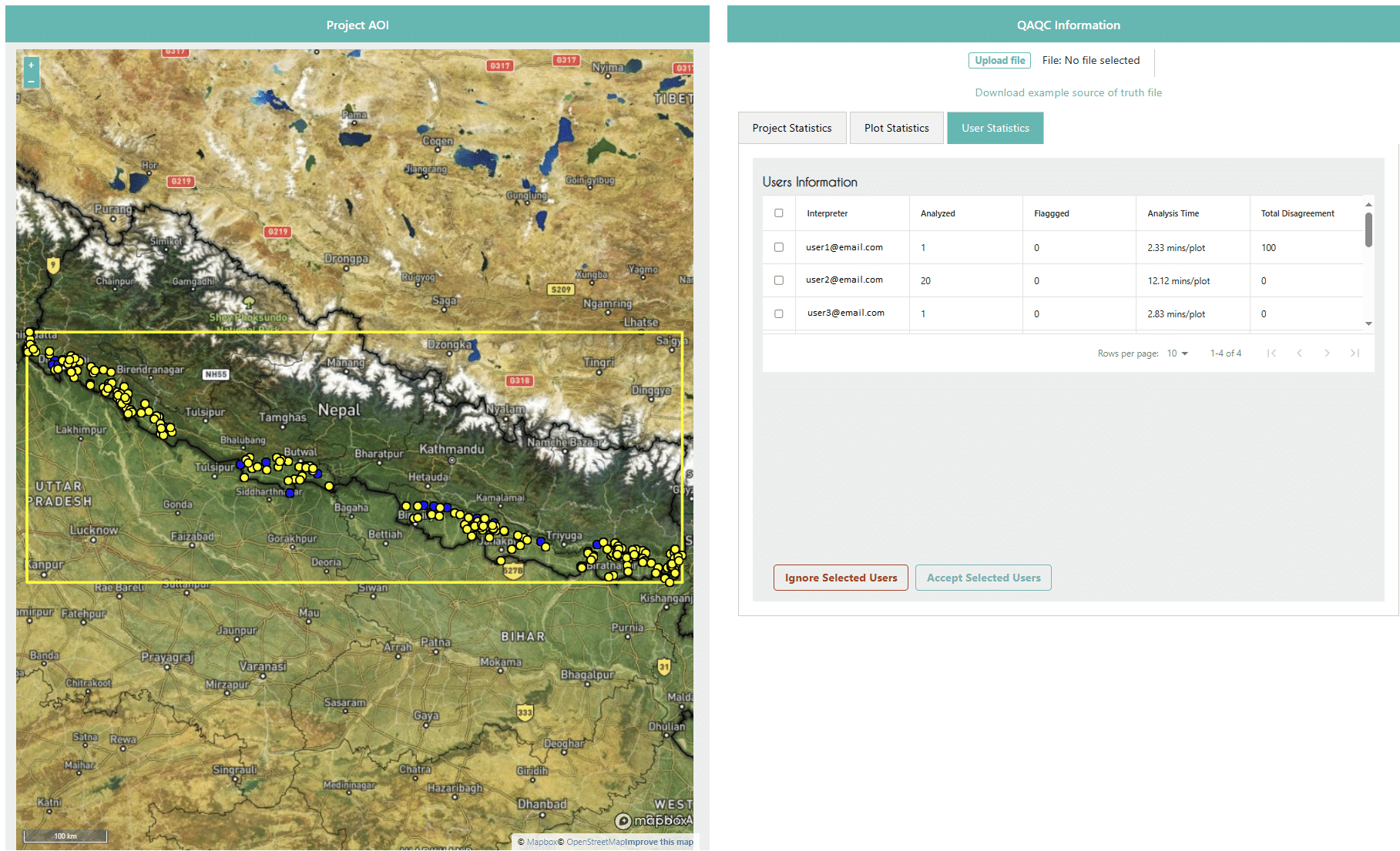
Importantly, the User Statistics tab also includes buttons for the Administrator to Ignore or Accept selected users. This is useful for managing user contributions to the project, including eliminating bad actors or users who are not contributing to the project in a meaningful way. When users are ignored, their data will not be included in downloaded data files and they will not contribute to QAQC statistics.
Collect Earth Online is working constantly to improve the user experience, and your feedback is invaluable. If you have ideas to share, please write to support@collect.earth.
Thank you!