Collect Earth Online’s (CEO) global community of users is constantly innovating and creating new ways to use CEO. Aurélie Shapiro recently integrated CEO with Microsoft’s Power BI data visualization software, creating a dashboard that allowed the data collectors to quickly see who had collected the most data and other important information.
The Central African Forest Initiative (CAFI) is supporting the FAO in executing a project assessing the direct drivers of deforestation and degradation using OpenForis tools, including CEO and SEPAL. Focusing on six Central African countries, FAO and national partners are quantifying the role of various direct drivers of change on forest disturbances since 2015.
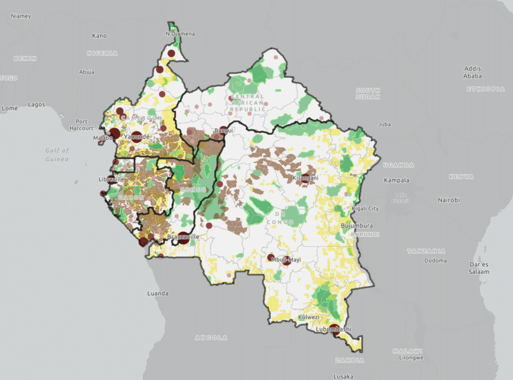
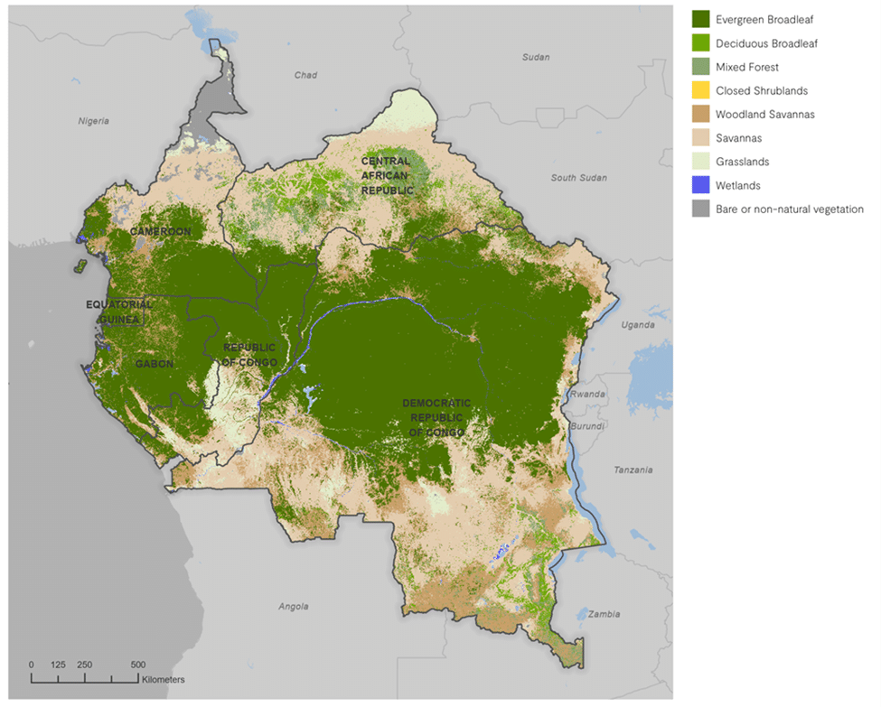
The pilot effort involves detecting areas of forest disturbance through time series analysis of Landsat imagery, and then validating those observations using CEO with a group of regional experts comprising the project’s technical committee. The six countries participating in the pilot included Central Africa: Cameroon, Central African Republic, Equatorial Guinea, Republic of Congo, Democratic Republic of Congo, and Gabon. The team first created a change map including areas of potential deforestation, degradation and stable forest, derived using the BFAST algorithm in SEPAL. The validation dataset included 11,874 random samples selected from all categories of the change map.
The Collect Earth Online survey questions were developed to obtain visually interpreted information on the land cover, type and date of change and the presence of one or more drivers using imagery time series available in CEO including Planet basemaps, Sentinel-2 and Landsat.
In the first phase of the project, we worked with experts from different countries, professional backgrounds, and knowledge of remote sensing. To increase the robustness of our results, we implemented cross-validation, which involved three users validating each point independently, and obtaining the majority result for final validation.
We split a group of nearly 50 validators from 6 African countries and elsewhere into 3 teams named after iconic Congo Basin tree species: Mukulungu, Sapelli, and Okoume. We created 3 CEO projects for each group before launching an intense validation campaign. Once ready and trained, the teams quickly set off to complete the daunting validation…11,874 x 3 = more than 30,000 points: Yikes!
During the validation process we decided to leverage Power BI software to track the progress of each team, and to determine the agreement of answers between teams – all in near real time as the data came in.
What is Power BI? It’s a data analytics software from Microsoft that lets you connect various datasets, automatically clean and connect them and create rich visualizations. We decided to explore Power BI for its ability to visualize data in real-time, through interactive, online dashboards.
Every day, I downloaded the latest sample data csvs from each project in CEO and ingested them into Power BI, automatically processing, cleaning, summarizing, and relating the tables with Control Query to link CEO email addresses to names, gender, home countries and stats by group.
This dashboard shows how many points were validated by which members of each team based in which country, which was a great way to encourage friendly competition. A leader board ranked users by the number of points they validated, and changed with each update. This dashboard, embedded on our project web site, was getting hundreds of hits a day as everyone eagerly logged in to check progress, encourage their peers and give shout-outs in lively whatsapp group conversations. Sometimes I would wake up to messages in the middle of the night, begging me to update the dashboard so that someone could top the ranking.
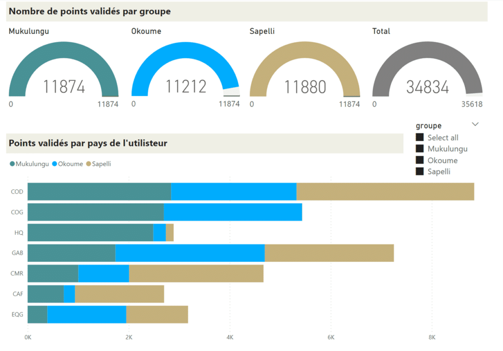
Here we can see that the Democratic Republic of Congo (COD) validated the most points (though granted, they are the biggest country and also had the most people available to validate), and the Mukulungu team was the first to reach the goal of 11,874 points. Okoume lost a little steam (but everyone did actually validate all the points – over the end of year holidays no less. Can you think of a better way to spend New Years? Not me).
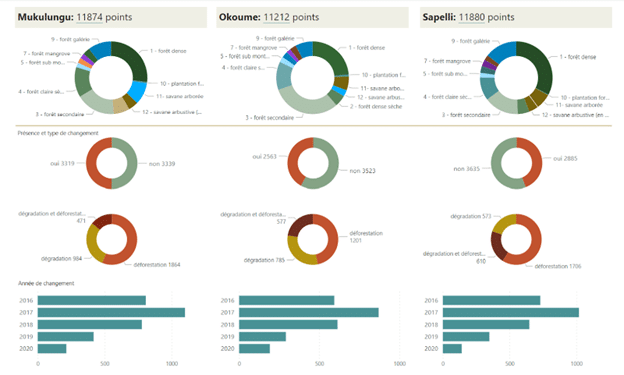
The next dashboard summarized each group’s responses on the land cover, disturbance type, and year of change for each group. We can see small differences in the interpretation of forest types for example (first row of pie charts) and the type of change (second row of charts), but a general agreement on the year of change (bottom row), with most disturbances being observed in 2017,and decreasing since then.
A final dashboard compared responses between the different teams and assessed agreement by counting the number of different answers: 1 or 2 means at least 2 of the 3 teams agreed.
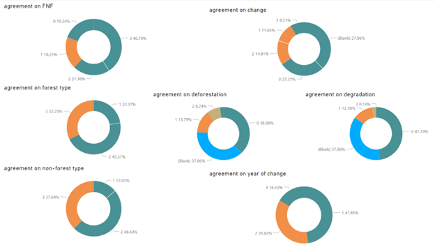
The highest agreement was in the forest/non-forest question, because that’s easy, right? We can see more detail in the other questions, such as the observed land cover type in either forest or non-forest and see how often (or seldom!) total consensus was obtained.
This provided valuable motivation to develop improved identification keys and refresher trainings to obtain more robust data from the crowd. We also determined that maybe it wasn’t a good idea to have experts from say, Gabon, validate data in the Central African Republic, where forest types are different, and so are the national definitions (4 unique definitions in 6 countries to be exact).
The use of Power BI (or any other data analysis tool for that matter) was a really engaging and visual way to monitor Collect Earth Online data collection in near real-time so perhaps you want to try it for your next CEO project? In addition to Power Bi (where you can really go gangbusters with Power Query), you can use Tableau, Google Looker Studio, ArcGIS Dashboards, or design your own in Python.
Where to begin? Here’s some resources we’ve found helpful.
CEO would like to thank its ongoing funders FAO, NASA–USAID SERVIR, and SilvaCarbon, a US government program. Thanks also to CEO’s technology partners: Norway’s International Climate & Forests Initiative for funding open high-resolution data availability; Planet for providing high-resolution imagery; and the Google Earth Engine team for creating a platform for Earth science data and analysis.
Collect Earth Online is working constantly to improve the user experience, and your feedback is invaluable. If you have ideas to share, please write to support@collect.earth.
Thank you!